Article Contents
Overview
What Goes In A Footer?
What Does A Good Footer Look Like?
Website footer design is critical to converting website traffic to leads, contacts, and sales. Footers that follow best practices also help build Local SEO, visitor trust and creditibility and are best built right from the start of a website project. The website footer is the last resort decision queue for many visitors that get to the end of pages and posts without finding what they want.
The purpose of a website footer is to help visitors find the information about your business that they are looking for at the bottom of pages.
Footers that use great design with a clear purpose to help visitors will help generate more sales, leads, and website traffic from Google.
We don’t obsess over footers but they are important and Design Shak and awwwards have covered many design trends and best practices for years now.
What Goes In A Website Footer?
Here’s a great list of components that can go in a website footer to help people that end up there find what they are looking for and also help search engines understand what you’re all about.
- Copyright
- Sitemap
- Privacy Policy
- Accessibility Statement
- Terms of Use
- Contact Information
- Address and a Map
- Phone Number
- Product Categories or Services Links
- Local SEO Geography Links
- Social Icons And Links
- Email Signup
- Website Search
- Team or Client Pictures
- Branding
- Keywords For SEO
- Trust Builders & Awards
- Association Memberships
- Call To Action
Clearly there are too many here to add everything and have a footer that is considered well designed and useful. The key is to select the most important footer components for your business considering your business needs and the needs of website visitors.
What Does A Good Footer Look Like?
Good website footer design incorporates a modern look and feel that matches the style of the rest of the website. There are many considerations including color scheme, layout, and functionality. Here’s a list of what should be considered:
- Look and feel of the website and footer
- Most important website footer components
- Layout and sizing
- Brand personality
And, here are some well designed footers (each for their own purpose and reasons) that you can consider for your website.

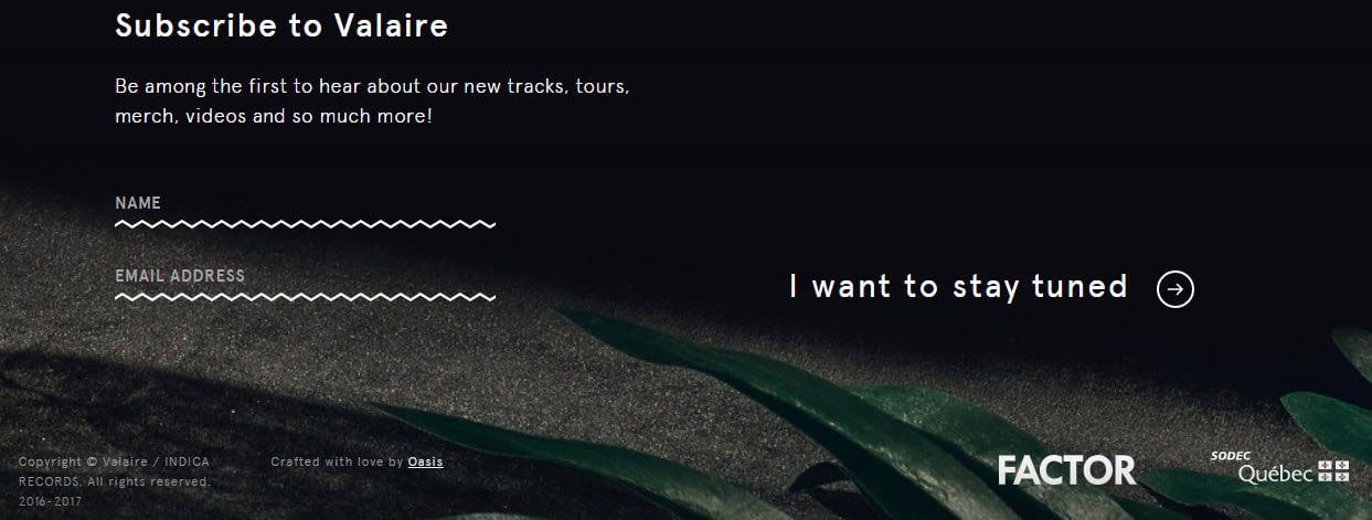
Valaire Footer Example
The footer on Valaire’s website focuses on asking the visitor to convert on a call to action. Copyright, terms, and trust builders are all minimized visually to focus on the call to action.

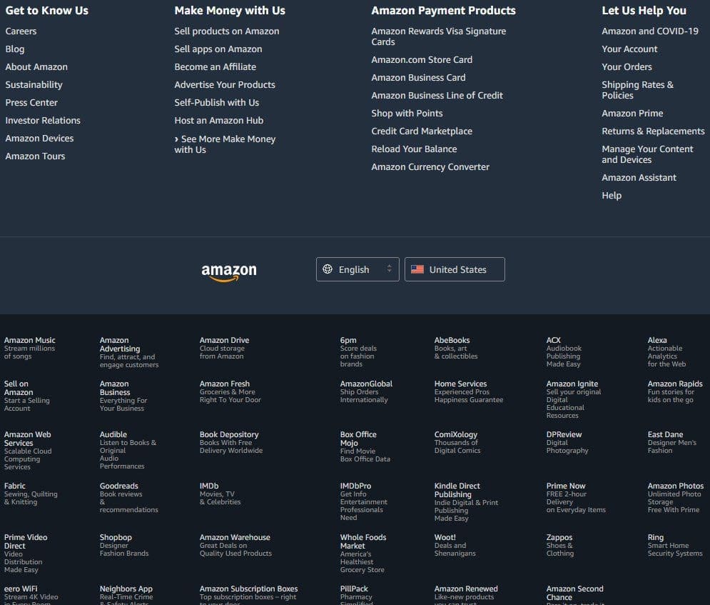
Amazon Website Footer Example
Amazon is a website that has an incredible number of different things going on at once. It’s not just a retailer. Further, Amazon is a data-focused company. They A/B test everything! So this footer design is clearly intended to get great performance for both people and build SEO for their various ventures.

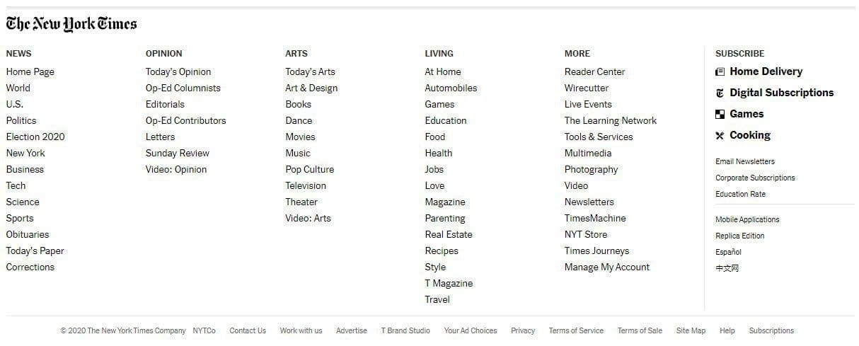
New York Times Website Footer
This footer focuses on navigation to the many different content areas of the website, as well as provides some hightlighted conversion options on the right. Terms of service, privacy and other equivelent links are minimized and grayed out to be less obvious.

Furrion Website Footer
Though I’m not a fan of the actual look of this footer, it solves multiple problems providing navigation, call to action, and social media validation all in one. You’ll again notice the subtle terms, privacy, and related links across the bottom. The reason these are minimized is that almost zero visitors will ever seek these out, so there is no reason to highlight them or take up important real estate on the screen. By minimizing this area compliance is maintained without wasting design or space.


